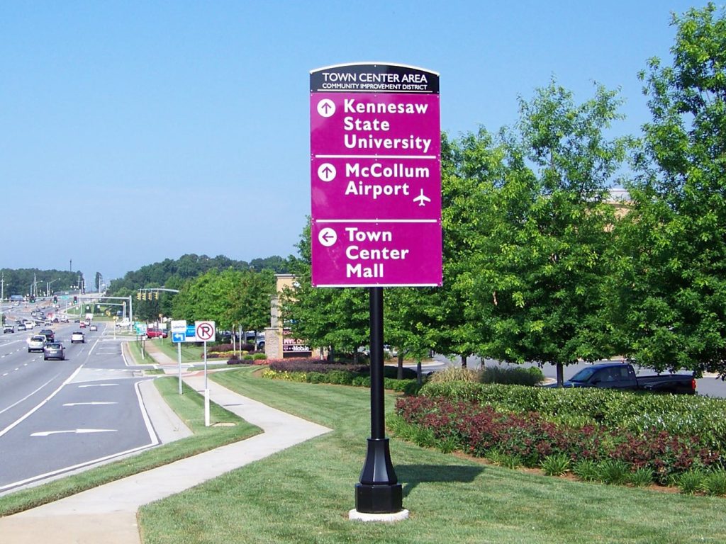
In the bustling corridors of urban travel, the clarity of a wayfinding system is not just beneficial—it’s crucial. The latest feature to catch our eye comes from the Town Center Area Community Improvement District, which has implemented a striking new wayfinding sign that encapsulates the essence of effective design in urban navigation.
This vertical wayfinding sign stands as a testament to the district’s commitment to clear and concise communication with motorists. Set against a vibrant magenta backdrop, the sign commands attention amid the visual noise of a cityscape, a bold choice that ensures its message is both seen and absorbed in an instant.
The sign’s structure is straightforward: three directional arrows, each pointing the way to a key landmark within the district. The top arrow guides travelers to the left, towards the educational hub of Kennesaw State University. The center arrow directs straight on, leading to the pivotal McCollum Airport. And the lower arrow, intuitively pointing right, guides visitors to the commercial heart of the area, the Town Center Mall.
What we admire about this design is not just its color choice or its striking verticality, but its adherence to the core principles of wayfinding design: legibility, simplicity, and the use of contrast. The white arrows and text against the magenta background create a visual pop that’s hard to ignore, even for those just passing through.
The sign stands alone on a single black pole, a minimalist approach that avoids clutter and meshes well with the urban design language. It’s positioned on a grassy median, framed by manicured shrubbery and trees, which not only adds to the area’s aesthetic but also serves as a green pause in the city’s concrete rhythm.
In our comprehensive article, we delve into the design process behind this wayfinding system. We explore the district’s objectives, the challenges faced, and the solutions brought to the table by the wayfinding specialists. Interviews with the designers reveal the thoughtful considerations that went into selecting the sign’s placement, height, and materials—choices that ensure durability and maintainability in an urban setting.
Moreover, we discuss the importance of such signs in the broader context of city planning and the role they play in enhancing the user experience for both residents and visitors. The Town Center Area’s wayfinding sign is more than a mere indicator of direction—it is an integral piece of the district’s identity and a navigation aid that speaks to the efficiency and hospitality of the community.
For city planners, urban designers, and wayfinding professionals seeking inspiration, our article is a must-read. It’s a deep dive into how design elements can be harnessed to guide, inform, and welcome in equal measure, proving that when it comes to urban wayfinding, boldness and simplicity can lead the way.