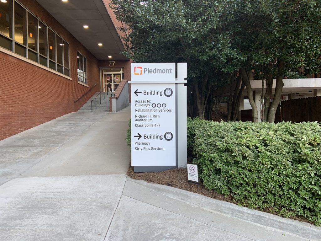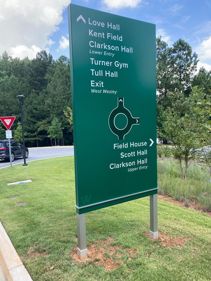
In the landscape of educational institutions where the flow of students, staff, and visitors is constant, the importance of effective wayfinding signage cannot be overstated. An exemplary model of such design can be observed in the wayfinding sign featured in a recent installation at a well-maintained campus setting, which we believe to be part of the Westminster Schools, given the monogram “W” discreetly placed on the sign.
The vertical structure of the sign, supported by two robust metal poles, stands as a testament to durability and thoughtful placement. The deep green background serves a dual purpose—it not only resonates with the institution’s identity but also provides a stark contrast against the white text, ensuring legibility from a distance and a quick comprehension for on-the-go students and faculty.
At the pinnacle of the sign, “Love Hall” is prominently displayed, with a leftward arrow guiding the way. This is followed by an orderly list of campus locations such as “Kent Field,” “Clarkson Hall Lower Entry,” “Turner Gym,” and “Tull Hall,” all pointing left, with “Exit” and “West Wesley” clearly marking the path to depart the campus. To the right, the sign guides to “Field House,” “Scott Hall,” and “Clarkson Hall Upper Entry,” cleverly using space and directional arrows to minimize confusion at what one can assume is a crucial intersection within the campus.
The addition of a roundabout symbol at the base of the sign is a stroke of genius, providing a visual cue that harmonizes with the actual “Yield” sign visible in the background. This subtle yet effective mimicry of the environment ensures that the wayfinding system is intuitive and directly reflective of the campus’s layout.
The surrounding area, with its manicured lawns and mature trees, suggests that the sign is part of a campus that prides itself on its appearance as much as its functionality. The choice of color, text, and symbols all speak to a modern design ethos that values clarity, accessibility, and aesthetic harmony.
This wayfinding sign is more than a utilitarian guide; it is a seamless part of the campus experience, aiding effortless navigation while contributing to the visual language of the institution. It stands as a benchmark for wayfinding solutions in environments where the clarity of direction is as foundational as the education provided within.
In a time where campuses are becoming more like small cities, with complex layouts and multiple destinations, such wayfinding systems are crucial in guiding the uninitiated and assisting the daily traverse of the familiar. We reduce cognitive overload, improve traffic flow, and enhance the overall aesthetic of the environment.
The design showcased here is a clear indicator of how wayfinding can be integrated thoughtfully into the campus fabric. As designers and planners look to the future, the intersection of functionality, form, and context—as exemplified by the Westminster Schools’ signage—will continue to be the gold standard for wayfinding solutions.