Project Profile: Branding and Wayfinding for New Tenant Buildout
Project Profile: Branding and Wayfinding for New Tenant Buildout
PROJECT OVERVIEW
Miller EG Design was engaged to deliver a full-scale branding and wayfinding solution for a newly renovated facility that previously lacked identity or navigational elements. The immediate challenge was to create and implement a branded environment that would ensure both seamless navigation and a bold, cohesive visual presence for the building’s grand opening.
This project required fast-tracked coordination between design, fabrication, and installation teams to meet a strict deadline. The outcome was a fully branded, intuitively navigable space launched on time—with signage acting as both functional wayfinding and brand storytelling.
DESIGN OBJECTIVES
Brand Establishment:
Implement a visual identity that aligns with the Emory’s broader brand while also giving this site a unique and place-specific feel.
Effective Navigation:
Ensure that first-time visitors and staff could easily find the building and access its key internal destinations without confusion.
Deadline-Driven Execution:
Deliver a fully operational signage system before the public opening, coordinating with construction and event teams for a turnkey debut.
Visibility and First Impressions:
Develop signage with strong visual presence to draw attention from approaching roadways and footpaths—acting as both guideposts and brand ambassadors.
DESIGN SOLUTIONS
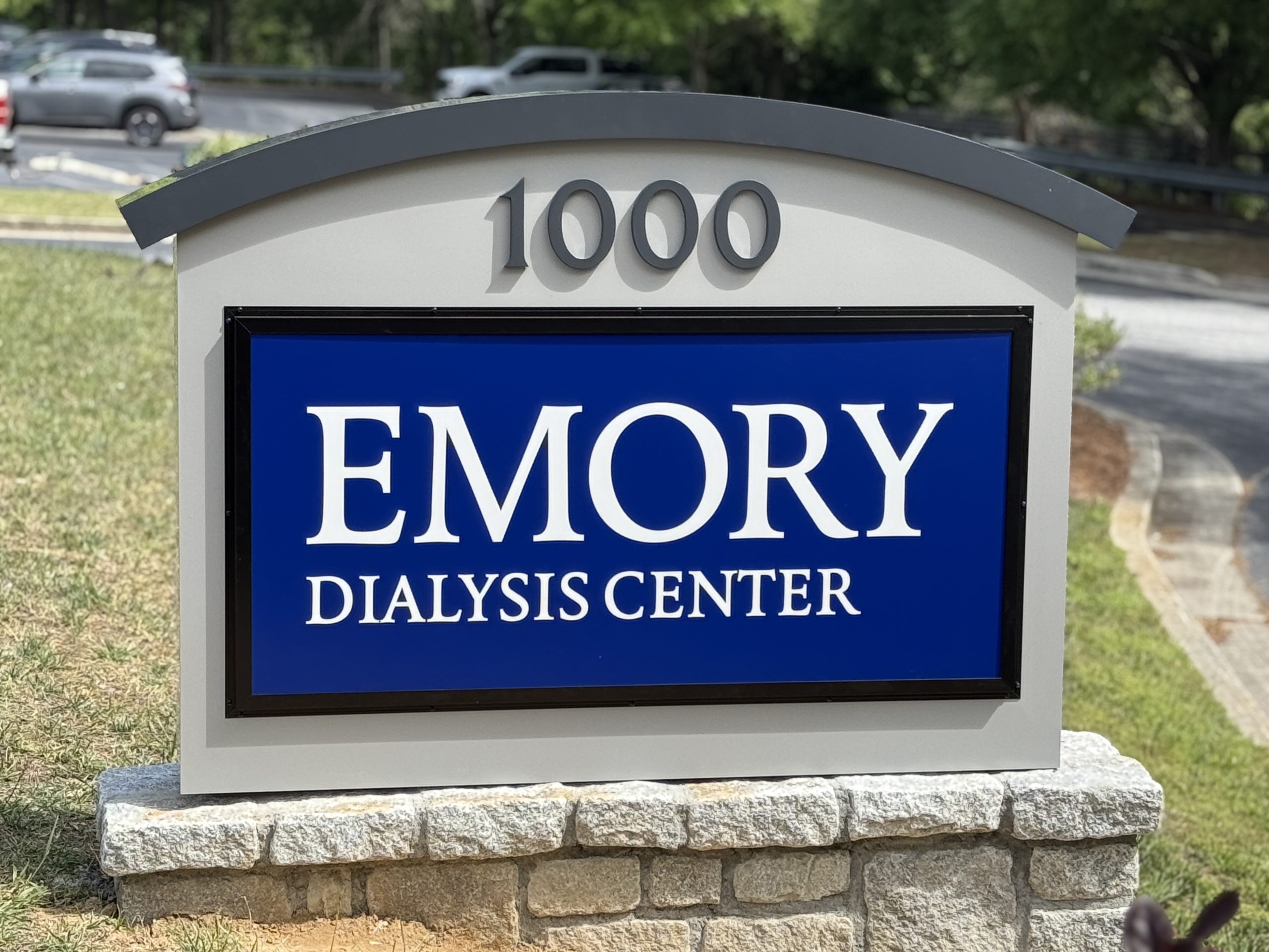
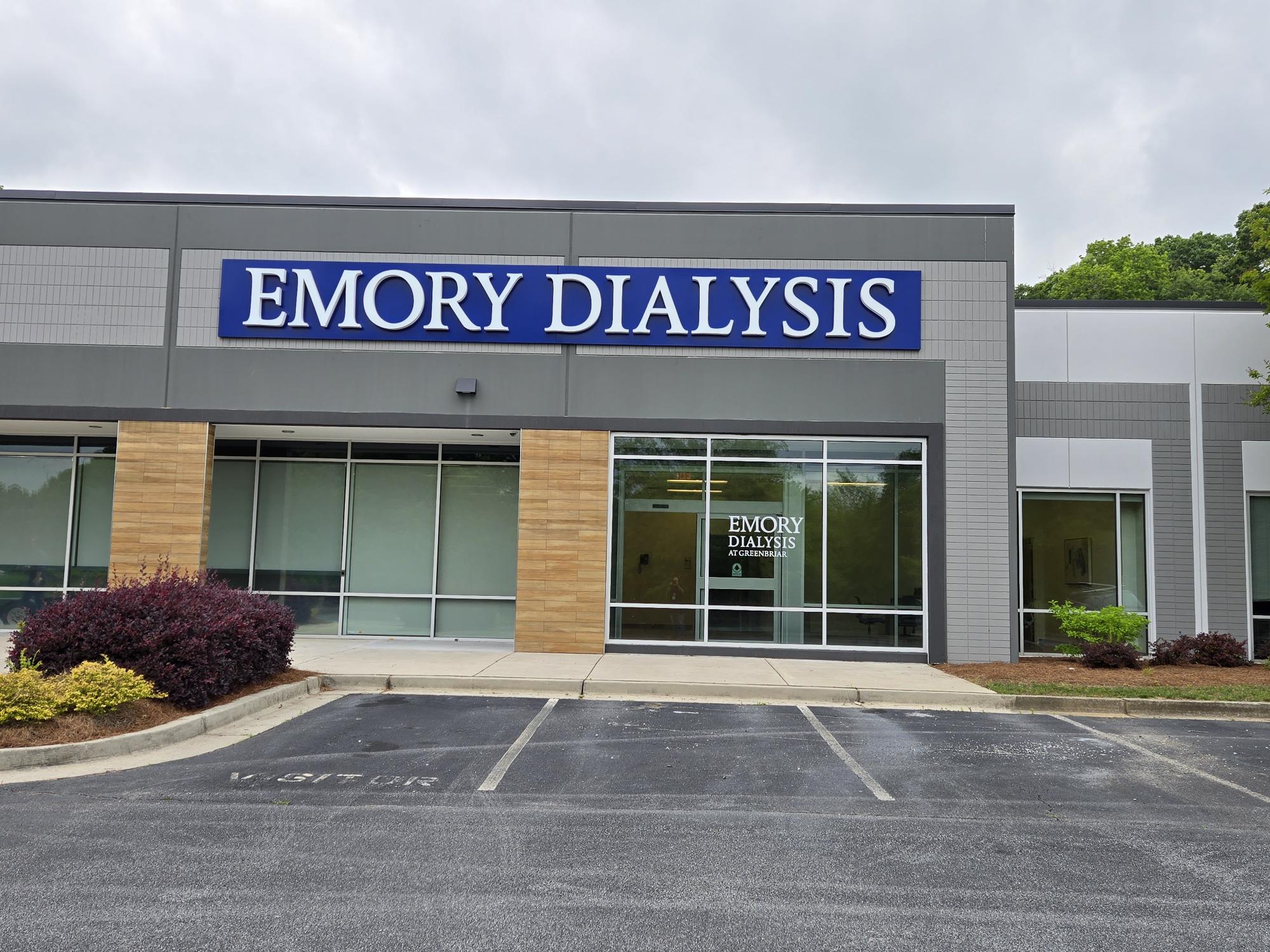
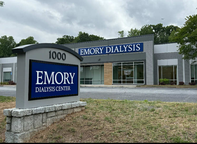
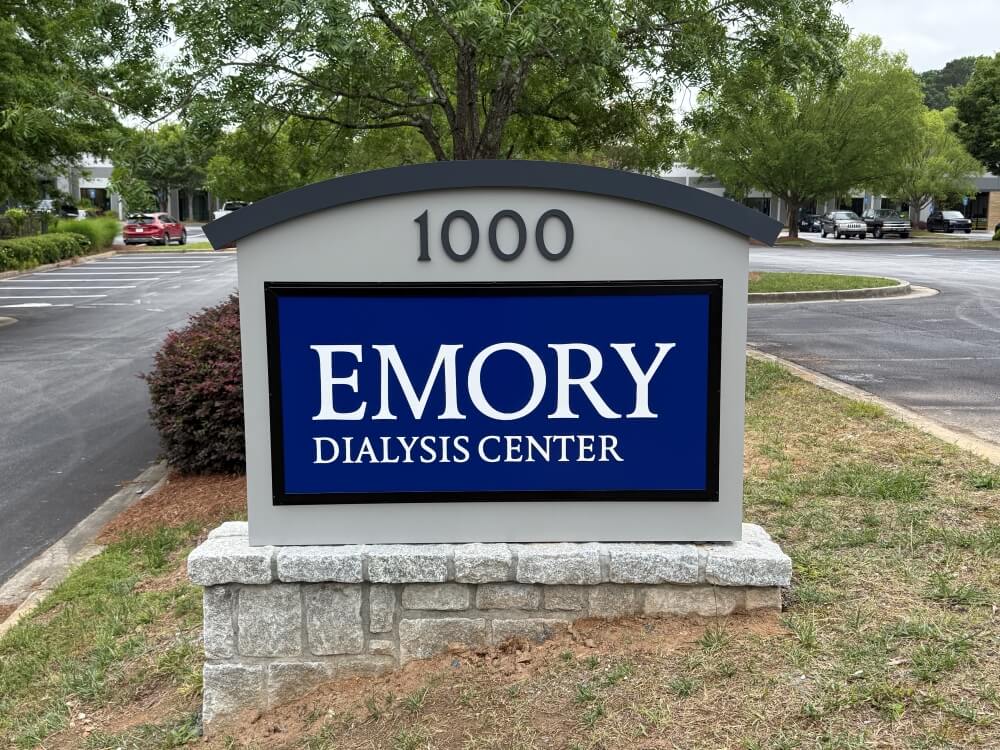
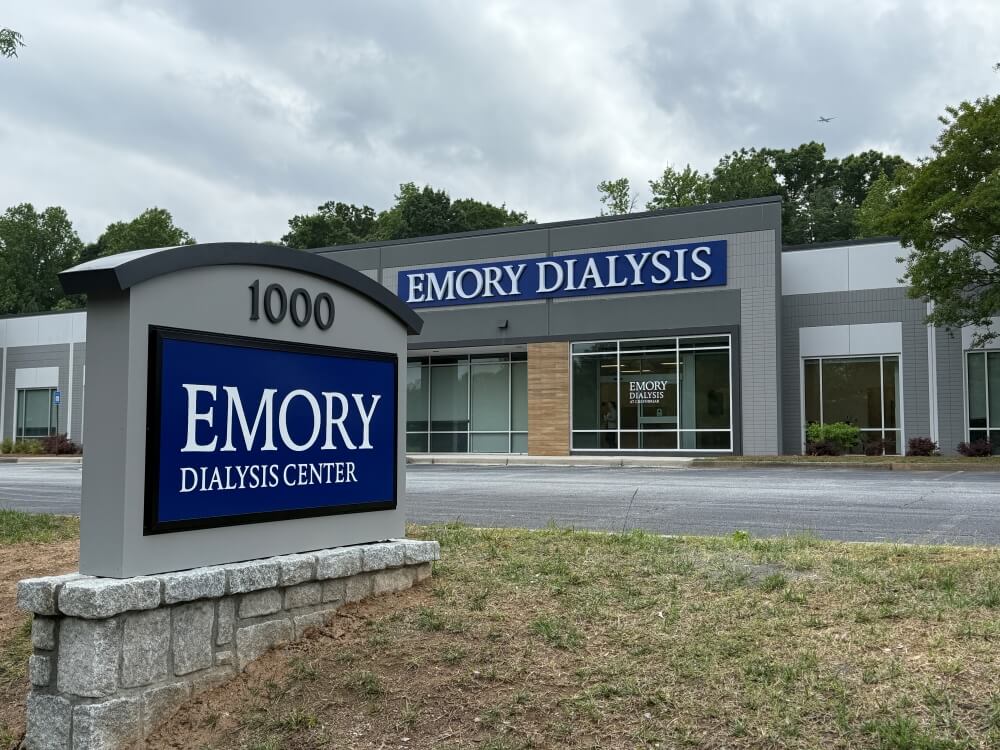
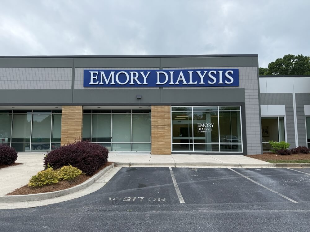
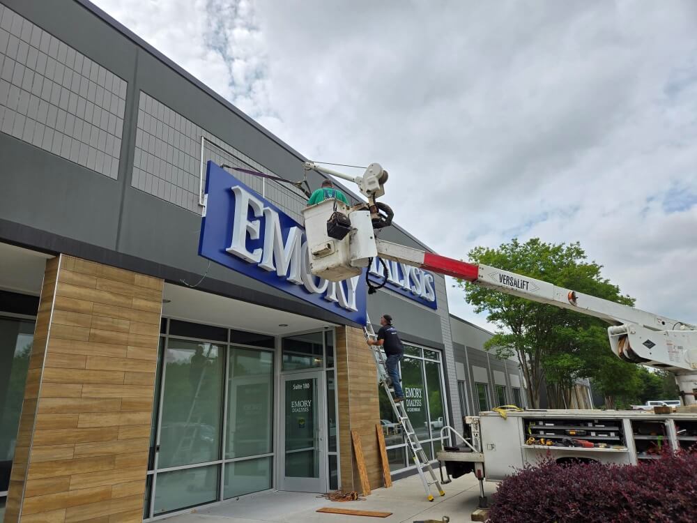
Exterior Identity & Directional Signage
Large monument signs and building-mounted identifiers were developed to anchor the site visually and guide vehicular traffic. These featured high-contrast typography and incorporated brand colors for instant recognition.
Entry Point Signage
Key thresholds were defined using illuminated ID signs and directional elements. This helped convey arrival and facilitated movement into the building for new visitors, particularly during the grand opening event.
Internal Wayfinding
Lobby directories, directional flag signs, and room IDs were installed to support intuitive navigation inside the facility. Materials and finishes were selected to match branding colors and materials while delivering durability and legibility.
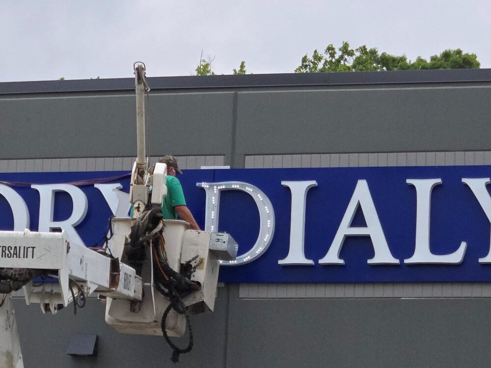
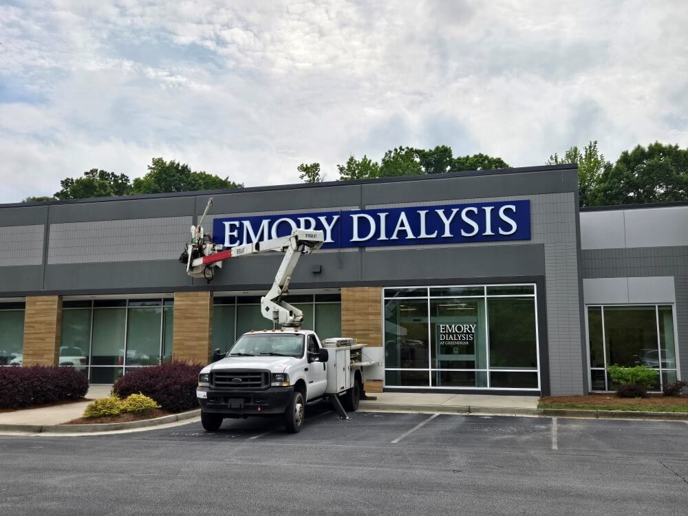
Rapid Prototyping and Fabrication
A combination of digital renderings and physical mockups allowed the MEGD team to accelerate decision-making and gain quick approvals—crucial to delivering within the tight timeline.
Production Techniques: CNC routing, vinyl application, LED integration.
Color Palette: Custom-matched to client branding (Pantone references supplied).
Typography: Legible sans-serif fonts chosen for readability at distance and consistency with brand.
RESULTS & IMPACT
Deadline Met: All signage was installed and operational prior to grand opening.
Enhanced Visitor Experience: Clear, inviting wayfinding reduced confusion and made a positive first impression.
Brand Recognition: The building now aligns with corporate branding, enhancing visibility and trust.
Scalable System: The installed signage sets a standard for potential expansion or replication at future locations.
STRATEGIC INSIGHT
This project exemplifies how wayfinding is not simply about directional signs—it’s a spatial communication strategy. By transforming a raw building into a branded experience, Miller EG Design leveraged experiential graphics to create both place identity and user confidence.
Through their deep expertise in experiential graphic design, MEGD translated abstract brand values into physical, navigable environments that function on aesthetic, emotional, and practical levels.