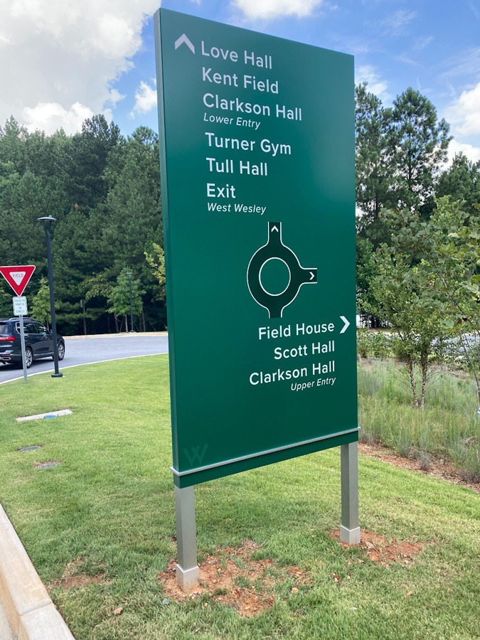
When it comes to navigating complex spaces, less really is more. In the world of wayfinding, clear and simple signage isn’t just a design preference—it’s a necessity.
At Miller EG Design, we approach signage with the belief that simplicity is what makes a space truly intuitive. Whether it’s a hospital campus, government facility, or community district, the clarity of signage directly impacts how people feel in that space—confident, oriented, and at ease.
At Miller EG Design, we approach signage with the belief that simplicity is what makes a space truly intuitive. Whether it’s a hospital campus, government facility, or community district, the clarity of signage directly impacts how people feel in that space—confident, oriented, and at ease.
Why “Clear and Simple” Matters
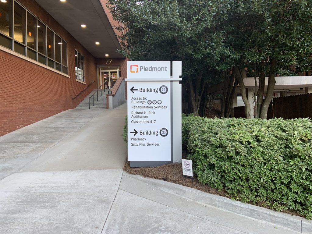
Imagine walking into a multi-building medical facility, unsure of where to go. A well-placed, high-contrast sign with clear typography and direct messaging can instantly remove the guesswork. That’s the power of simplicity—it creates trust in the environment.
Imagine walking into a multi-building medical facility, unsure of where to go. A well-placed, high-contrast sign with clear typography and direct messaging can instantly remove the guesswork. That’s the power of simplicity—it creates trust in the environment.
Clear signage reduces cognitive load. The user shouldn’t have to interpret or translate what a sign is trying to say. It should be understood at a glance. As we outline in our article “Optimizing Navigation: 12 Factors for Better Wayfinding,” clarity is one of the foundational elements for good navigation.
Case in Point: Hall County Government Facilities
In 2020, Miller EG Design partnered with Hall County on a signage rejuvenation program. The goal: replace outdated and inconsistent signage with a cleaner, unified system.
We implemented:
In 2020, Miller EG Design partnered with Hall County on a signage rejuvenation program. The goal: replace outdated and inconsistent signage with a cleaner, unified system.
We implemented:
- Simple messaging with minimal words and intuitive icons
- High-contrast color schemes for easy readability
- Uniform typography across all departments and building IDs
What happened next? Visitors—whether residents paying taxes or contractors attending meetings—reported faster navigation and fewer questions at reception. Staff productivity improved because signage started doing its job: guiding people clearly and efficiently.
Best Practices for Clear & Simple Signage
Here’s what we recommend:
- Stick to One Message per Sign
Avoid information overload. If needed, break directions into sequential steps. - Use Familiar Language
“Restroom” instead of “Facilities.” “Lobby” instead of “Main Receiving.” - Maximize Contrast
Dark text on light backgrounds or vice versa—no unnecessary design flourishes. - Prioritize Legibility
Choose fonts designed for signage, not style. ADA-compliant typography matters. - Let Icons Speak
Pictograms are universal. Pair them with text for speed and clarity.
Simplicity is Sophistication
Simple signage isn’t basic—it’s strategic. It requires discipline in design, attention to user behavior, and a deep understanding of spatial flow.
When signage gets out of the way, users get where they need to go—faster, with less stress. That’s the hallmark of a space designed with care.
Simple signage isn’t basic—it’s strategic. It requires discipline in design, attention to user behavior, and a deep understanding of spatial flow.
When signage gets out of the way, users get where they need to go—faster, with less stress. That’s the hallmark of a space designed with care.