Client: Emory Healthcare
Scope: Campus-Wide Interior and Exterior Signage Implementation
Location: Atlanta, Georgia
When Emory Musculoskeletal Institute (EMI) expanded its facility, the complexity of navigating a medical campus posed a clear challenge. Patients and visitors—often under stress—needed a calming, effortless navigation experience. Miller EG Design was brought on to craft a wayfinding system that didn’t just direct, but reassured.
Our solution was rooted in a user-first strategy that treated wayfinding as a sequence—not a scatter of signs. We used a progressive disclosure approach to minimize cognitive load, guiding each user through the space with exactly the right information, exactly when they needed it.
1. Hierarchical Messaging
At every decision point, information was structured from general to specific. Core destinations like “Check-In”, “Elevators”, and “Orthopedics” were prioritized in large, legible typography. Subordinate messages—such as suite numbers and departments—were layered below in a logical flow.
Rather than overwhelming visitors with all information at once, we staged messages across the environment. As users moved deeper into the building, signage became more detailed—mirroring the path of discovery and reducing stress.
Every sign was meticulously placed to align with natural moments of decision. We avoided cluttered signage at entrances and instead delivered the right message at the right time—building confidence in the navigation system as users progressed.
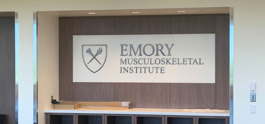
- Copper Logo and Dimensional Graphics anchored branding in both prestige and permanence.
- Large-Scale Cut Vinyl Interior Graphics served as visual landmarks, enhancing orientation while elevating the aesthetic environment.
- Flag-Style Wall Directionals, Exam Room ID Signs, and Conference Room Plaques delivered consistent, accessible messaging throughout the campus.
Design Impact:
“Spaces that feel easy to navigate don’t happen by accident.”
Why Logical Flow Matters in Healthcare:
- Reduces Cognitive Load: Patients and visitors absorb only what they need in the moment.
- Promotes Intuitive Movement: Each step leads naturally to the next.
- Builds Trust: An intuitive space fosters confidence in both environment and care providers.
- Enhances Brand Identity: Consistent visual language reinforces Emory’s commitment to clarity, precision, and care.
The Emory Musculoskeletal Institute is a model for healthcare wayfinding that goes beyond directional signage. It’s a fully integrated system of information choreography—proof that better wayfinding starts not with signs, but with empathy, strategy, and a deep understanding of human movement.
Want to see logical flow in action?
Contact us to tour the Emory Musculoskeletal Institute installation.
We create Better Wayfinding through Experiential Graphics.