Location: Toccoa, Georgia
Client/Facility: Northeast Georgia Physicians Group (NGPG) Urgent Care
Overview
NGPG’s Toccoa urgent care serves families at high-stress moments—especially in pediatrics, where anxiety, uncertainty, and sensory overload can peak quickly. This project reframed the Pediatrics Wing from a sterile corridor experience into a welcoming, story-led environment that helps children (and caregivers) feel oriented, comforted, and even a little delighted—an approach aligned with Miller EG Design’s experiential wayfinding philosophy.
Design Intent
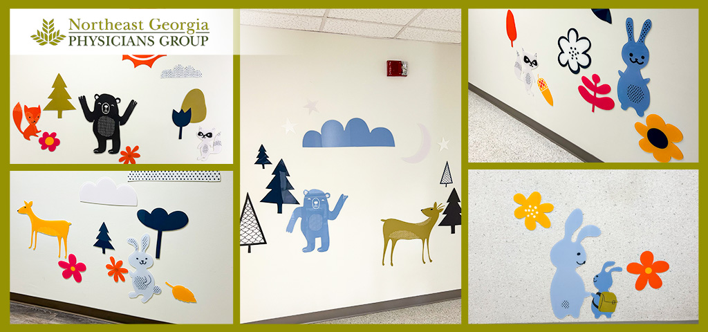
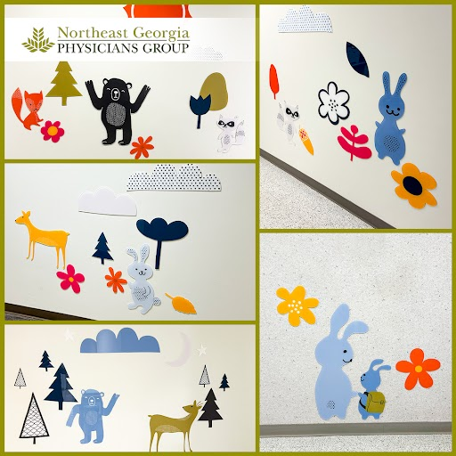
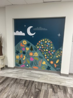
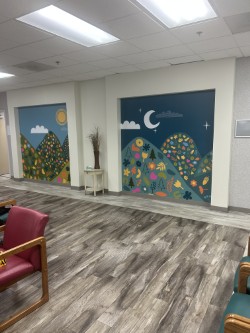
The acrylic installations function as experiential wayfinding: rather than relying only on directories and arrows, the environment itself becomes a navigational cue. Bold, playful vignettes—rolling hills, sun/moon motifs, clouds, stars, and woodland characters—provide memorable identifiers that help families recall where they’ve been and where they’re going (“the bunny wall,” “the night sky mural,” “the bear and deer”).
A narrative that reduces stress
The graphics create a simple, readable story world: day-to-night skies, patterned landscapes, and approachable animal figures. This story layer does practical work: it softens the perceived wait, supports calmer transitions between spaces, and gives staff and caregivers easy language for reassurance and directions.
What Was Installed
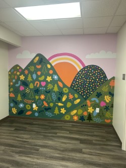
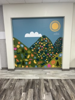
Large-scale scenic wall moments as landmarks
The hill-and-sky compositions read like “portals” or framed scenes—strong, centralized compositions that act as destination markers within the wing. These big, graphic landscapes establish identity instantly and provide consistent continuity as people move through the area.
Material + Fabrication Considerations
Why acrylic works in healthcare pediatrics
- Durability & cleanability: smooth, non-porous surfaces align with healthcare maintenance needs and frequent cleaning.
- Dimensionality without risk: adds tactile depth and visual interest while maintaining controlled edges and predictable wall behavior.
- Color fidelity: saturated, high-contrast hues stay crisp under typical ceiling grid lighting and long corridors.
- Modularity: individual elements can be replaced if damaged without redoing an entire wall.
Installation approach
The pieces are installed as stand-off dimensional elements with consistent spacing and alignment, suggesting a deliberate “gallery” logic rather than scattered decoration. This matters: the spacing and grouping keep the wing feeling designed, not improvised—supporting trust and comfort in a clinical setting.
Wayfinding Performance
- Big scenic walls act like “you are here” moments.
- Character groupings create memorable points along corridors.
- The repeated sky/landscape language provides continuity and helps users understand they are still within the pediatrics experience zone.
Landmark-based navigation
Relationship to the Larger Signage Scope
- Exterior building letters/logos (visibility + brand presence)
- Road entrance signage (first decision point + arrival confidence)
- Receptionist signage (check-in clarity + first interior orientation)
Community Identity and “Soft Branding”
Rather than overtly branding every surface, the Pediatrics Wing uses a “soft branding” approach: a consistent visual language that feels local, warm, and approachable. The woodland motifs and optimistic color palette create a gentle regional resonance—an environment that reads as care-centered rather than purely institutional.
Outcomes
- Transformed pediatrics from a sterile corridor experience into a welcoming, child-friendly destination
- Added experiential wayfinding landmarks that reduce stress and improve intuitive navigation
- Delivered a durable, maintainable solution suited to healthcare operations
- Reinforced NGPG’s commitment to patient experience—especially for young children and families—through environmental storytelling