Walk into a space and, within seconds, your body decides how to feel. Heart rate shifts. Muscles tense—or relax. In behavioral health environments, those first impressions matter more than almost anywhere else. Color and typography aren’t just aesthetic choices; they’re powerful tools that can reduce anxiety, support emotional regulation, and help patients feel safe the moment they arrive.
At Miller EG Design, we approach behavioral health design with intention, understanding that every visual detail influences how people experience care.
Why Color Psychology Matters in Behavioral Health Design
Color psychology plays a critical role in shaping emotional responses. In behavioral health settings, overstimulation can increase stress, while poorly chosen palettes can feel cold or institutional. Thoughtful color selection helps create a sense of balance and calm.
Soft, muted hues such as warm neutrals, gentle blues, and nature-inspired greens are often associated with relaxation and emotional stability. These tones can help lower blood pressure, reduce agitation, and create an environment that feels supportive rather than clinical. Earthy accents, when used sparingly, add warmth and familiarity without overwhelming the senses.
Equally important is contrast. High-contrast combinations can feel harsh or triggering, while low-contrast palettes promote visual comfort. In hallways, patient rooms, and therapy spaces, color transitions should feel natural and intuitive, guiding movement without visual tension.
Typography as a Tool for Emotional Ease
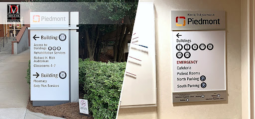
Typography is frequently overlooked, yet it has a profound impact on how people process information—especially in behavioral health environments. Fonts that are overly decorative, condensed, or aggressive can increase confusion or stress. Clear, human-centered typography supports comprehension and reduces cognitive load.
Sans-serif typefaces with rounded edges are often preferred because they feel approachable and easy to read. Consistent font usage across signage, wayfinding, and educational materials helps patients and visitors navigate spaces confidently. When people don’t have to struggle to understand signage, they feel more in control, which is essential in behavioral health settings.
Spacing matters, too. Generous letter spacing and adequate line height improve readability, particularly for individuals experiencing anxiety, trauma, or cognitive challenges. Typography should quietly support the environment, never demanding attention or creating frustration.
Creating Cohesion Between Color and Type
The most effective behavioral health interiors align color and typography into a cohesive visual system. When fonts and colors work together, the environment feels intentional and predictable—qualities that foster trust and comfort.
For example, pairing calming wall colors with soft, neutral typography in wayfinding signage reinforces a sense of order. Accent colors can be used strategically to highlight important information without overwhelming patients. This balance helps create environments that feel both supportive and functional.
Consistency across spaces is key. From intake areas to therapy rooms, visual continuity reassures patients that they are in a safe, well-considered environment. Miller EG Design emphasizes unified design systems that support both emotional well-being and operational efficiency.
Practical Design Insights for Behavioral Health Spaces
Designing for behavioral health requires empathy and precision. Here are a few practical principles we apply:
- Use color zoning to subtly differentiate areas without abrupt changes
• Avoid stark whites; opt for warm neutrals that feel less clinical
• Choose typography that prioritizes clarity and accessibility
• Limit visual clutter to reduce sensory overload
• Incorporate natural tones that reference outdoor environments
These strategies work together to create spaces that promote calm, dignity, and healing.
Designing with Purpose at Miller EG Design
Miller EG Design specializes in environments where visual communication supports care. Our team understands that behavioral health design isn’t about trends—it’s about creating spaces that respect emotional vulnerability and encourage healing. From color palettes to typography systems, every decision is guided by research, experience, and compassion.
We are proud to serve clients from our Acworth, Georgia office at 315 Northpoint Parkway SE, Suite F, Acworth, GA 30102. If you’re planning or reimagining a behavioral health space and want design choices that truly support patient well-being, contact Miller EG Design at (404) 947-6448 to start the conversation.