Consistent design doesn’t just look good—it helps people move confidently through a space. See how Miller EG Design used visual consistency to unify wayfinding across Hall County’s government facilities.
In wayfinding, clarity is king—but consistency is the glue that holds a signage system together. At Miller EG Design, we believe that when visual elements speak the same language, users don’t have to stop and “think” their way through a space—they simply move.
A unified visual language—consistent typography, color coding, materials, and layout—acts as a subconscious guide. It tells people: “This sign belongs here. You can trust it.”
When signage is inconsistent, even small visual differences (like a mismatched font or color variation) can cause users to hesitate, question directions, or overlook important information. By reducing that cognitive load, a consistent system gives people the confidence to navigate smoothly.
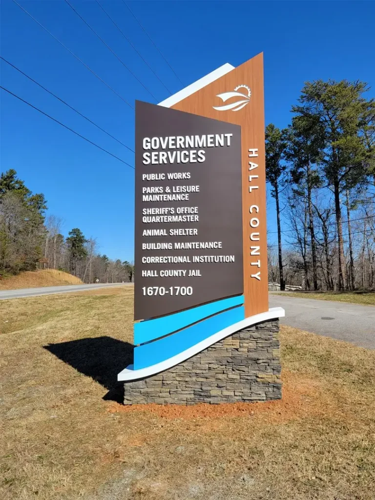
When Miller EG Design began working with Hall County in 2020, one of the first things we noticed was a lack of cohesion in their signage. Different departments had adopted different design standards—fonts, materials, even terminology—which made the public experience inconsistent and frustrating.
We developed a county-wide signage program rooted in visual consistency, including:
- Standardized typography that improved legibility across environments
- Color-coded signage to distinguish building types and functions
- Material consistency for both interior and exterior signs
- Unified terminology and iconography to reinforce understanding
The Outcome
Takeaway:
Consistency isn’t just a design detail—it’s a way to build trust, reduce stress, and create spaces that people feel comfortable navigating. At Miller EG Design, it’s a cornerstone of every wayfinding system we build.