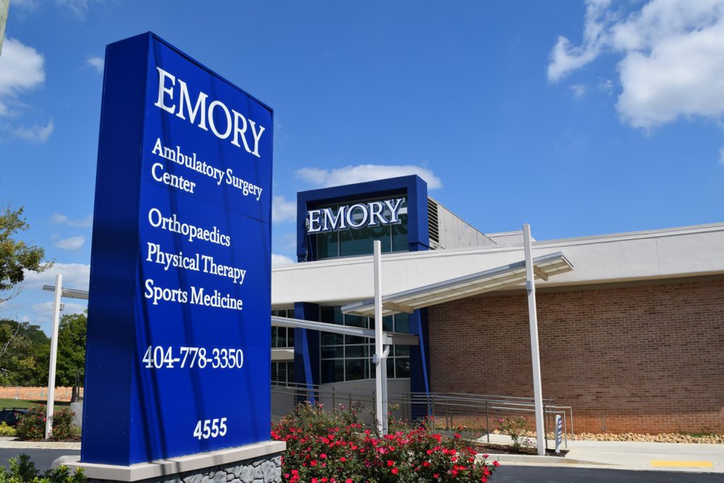
Emory Healthcare has long been synonymous with excellence in patient care, and their latest wayfinding initiative at the Dunwoody location is a testament to their commitment to patient experience. Featured in our issue of “Healthcare Facilities Today,” Emory’s new monument sign is a paragon of how to blend functionality, design, and brand identity seamlessly.
Strategically positioned at the facility’s forefront, the sign’s striking blue backdrop stands out in vivid contrast to the white text, ensuring that each word is legible even from a distance. It’s not just a directional tool but a bold declaration of Emory’s presence in the community. The listed services—ranging from ambulatory surgery to sports medicine—provide a quick reference for visitors, guiding them to the care they seek.
A phone number is prominently displayed, offering a direct line to assistance, further simplifying the visitor experience. Below, the address number is clearly stated, anchoring the facility in its geographical context and aiding in easy navigation for first-time visitors or emergency services.
What catches the eye is the strategic use of branding. The “EMORY” name atop the sign is replicated on the building facade, creating a coherent visual identity that resonates with viewers and reinforces the institution’s reputation. This consistent branding is a crucial aspect of wayfinding design, as it builds trust and recognition—a fact not lost on the designers at Emory Healthcare.
Our article delves deeper into the design process behind this wayfinding sign, exploring the decisions that led to the selection of color, typography, and placement. We discuss the importance of such signs in creating a welcoming environment and how we can reduce anxiety for those seeking medical care.
Interviews with Emory’s facilities and design team shed light on the challenges and triumphs of creating a wayfinding system that is both informative and indicative of the institution’s dedication to patient care. We share insights on the role of landscaping in enhancing the sign’s visibility and the importance of maintaining brand consistency across various touchpoints.
The wayfinding sign at Emory Dunwoody is not merely a guidepost; it is a reflection of the facility’s dedication to providing a clear and comforting journey for its visitors. It stands as a beacon that guides, informs, and reassures—a bright spot on the healthcare landscape.