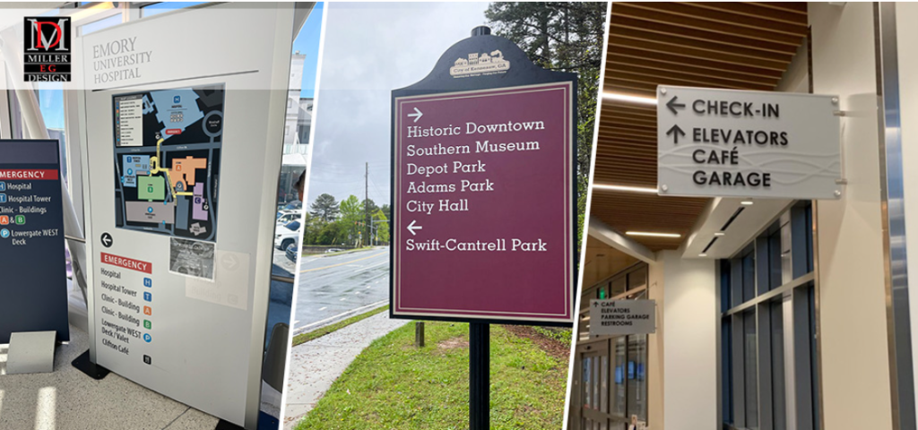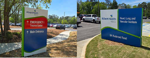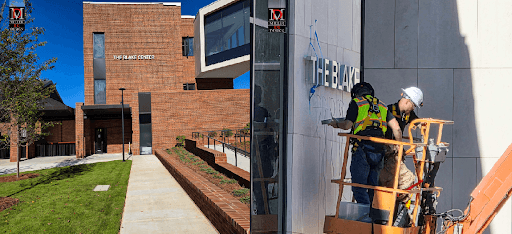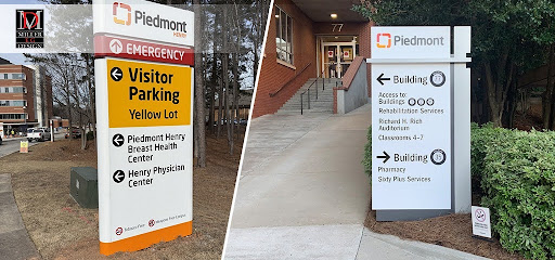
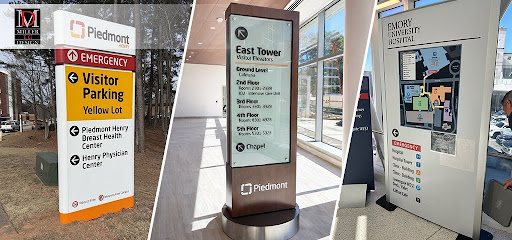
Healthcare facilities are often some of the most challenging environments to navigate. Large hospital campuses, specialty clinics, outpatient centers, and medical office buildings may contain multiple entrances, departments, elevators, and wings. Without a clear navigation system, patients and visitors can quickly become confused, increasing stress before they even reach their appointments.
This is where corporate identity becomes more than a marketing tool. When integrated into a healthcare facility’s wayfinding strategy, corporate identity elements help create a consistent visual language that guides visitors naturally while reinforcing the organization’s professionalism and trustworthiness.
Why Is Wayfinding So Important in Healthcare?
Unlike retail stores or office buildings, healthcare environments often welcome first-time visitors who may already be anxious about medical appointments. A confusing layout can increase frustration, cause missed appointments, and place additional demands on hospital staff who must constantly provide directions.
According to the Center for Health Design, ineffective wayfinding contributes to patient stress and operational inefficiencies, while thoughtfully designed navigation systems improve patient satisfaction and overall facility performance. Healthcare organizations increasingly recognize that effective wayfinding is part of delivering quality patient care.
What Are Corporate Identity Elements?
Corporate identity includes the visual components that represent an organization’s brand throughout its facilities. These may include:
- Brand colors
- Typography
- Logos
- Graphic patterns
- Department color coding
- Icons and symbols
- Environmental graphics
- Architectural finishes
Rather than existing only on marketing materials, these elements can become practical navigation tools throughout a healthcare campus.
How Do Brand Colors Help People Navigate?
Color is one of the quickest visual cues people recognize.
Many hospitals assign different colors to departments or building zones. For example, pediatric services may feature bright, welcoming colors, while cardiology or oncology departments may use distinct color palettes that appear consistently on signs, directories, floor graphics, and wall accents.
Visitors begin associating these colors with destinations, allowing them to navigate more confidently without reading every sign.
This approach also creates a more cohesive healthcare environment where branding and navigation work together.
Can Typography Improve Readability?
Typography plays a surprisingly important role in healthcare wayfinding.
Clear, high-contrast fonts improve readability for patients of all ages, including individuals with limited vision. Consistent typography across directories, room identification signs, elevator signage, and digital displays eliminates confusion because visitors immediately recognize official directional information.
The U.S. Census Bureau estimates that adults aged 65 and older will continue representing a growing share of the population, making accessible signage increasingly important for healthcare providers.
Why Are Consistent Icons Important?
Not every visitor speaks the same language or reads signs quickly during stressful situations.
Universal symbols for restrooms, elevators, emergency services, pharmacies, imaging departments, and exits help patients navigate regardless of language barriers.
When icons remain consistent throughout the facility, visitors gain confidence that they are following the correct path.
These visual cues also support accessibility initiatives and create a more inclusive environment for diverse patient populations.
How Does Environmental Graphics Reinforce Wayfinding?
Environmental graphics combine branding with architectural design.
Large wall murals, branded patterns, inspirational messaging, and landmark graphics help visitors identify major destinations while making healthcare spaces feel less institutional.
Instead of relying solely on directional signs, environmental graphics create memorable landmarks that simplify navigation.
For example, patients may remember turning at a blue mural or following a nature-themed corridor rather than memorizing hallway numbers.
This makes navigating large campuses significantly easier.
Why Is Consistency Essential?
One of the biggest mistakes organizations make is using different design styles throughout a facility.
Signs with inconsistent fonts, colors, materials, or messaging create uncertainty. Visitors may question whether they are following the correct directions.
A unified corporate identity ensures every sign, directory, room marker, digital display, and exterior monument works together as one complete navigation system.
Consistency also strengthens brand recognition and communicates professionalism.
Does Better Wayfinding Improve Patient Experience?
Yes.
Research published by the Center for Health Design has shown that effective wayfinding reduces stress, improves visitor satisfaction, decreases late arrivals, and minimizes interruptions to healthcare staff who would otherwise spend time providing directions.
An intuitive navigation system allows medical professionals to focus more on patient care while helping visitors reach their destinations with confidence.
When branding and wayfinding are planned together from the beginning, healthcare organizations create environments that feel organized, welcoming, and easier to navigate.
Why Should Healthcare Facilities Invest in Professional Wayfinding Design?
Healthcare campuses continue growing in size and complexity. Modern hospitals include multiple specialties, outpatient clinics, emergency departments, administrative offices, and parking structures that require coordinated navigation.
Professional wayfinding designers understand how branding, architecture, accessibility standards, and user behavior work together to create systems that improve both patient experiences and operational efficiency. Investing in comprehensive planning today can reduce confusion, improve first impressions, and strengthen an organization’s identity for years to come.
If your organization is looking for wayfinding design in Nashville and throughout Metro Atlanta and neighboring communities, we are here to help. At Miller EG Design, we create customized environmental graphics, signage systems, and branded wayfinding solutions that improve navigation while reinforcing your organization’s identity. Visit us at 315 Northpoint Pkwy SE Suite F, Acworth, GA 30102, or call (404) 947-6448 to learn how we can help transform your healthcare facility with expertly designed wayfinding solutions.